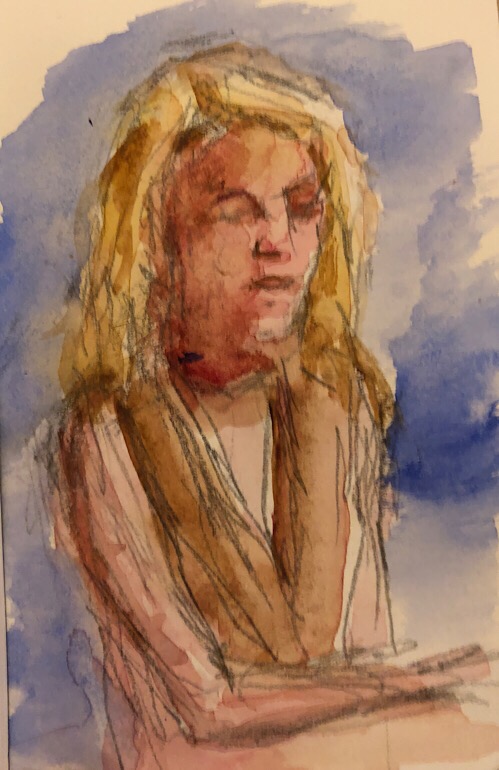
Yet another iPad sketch, with an Apple pencil. I’m starting to love this thing.
Geoff Watson, “Studying,” iPad sketch, 2018.
Yet another iPad sketch, with an Apple pencil. I’m starting to love this thing.

Geoff Watson, “Studying,” iPad sketch, 2018.
I’ve been spending more time playing with Procreate, a sketch/paint app for the iPad. I’m getting more comfortable with it. Maybe I’ll add some color next.
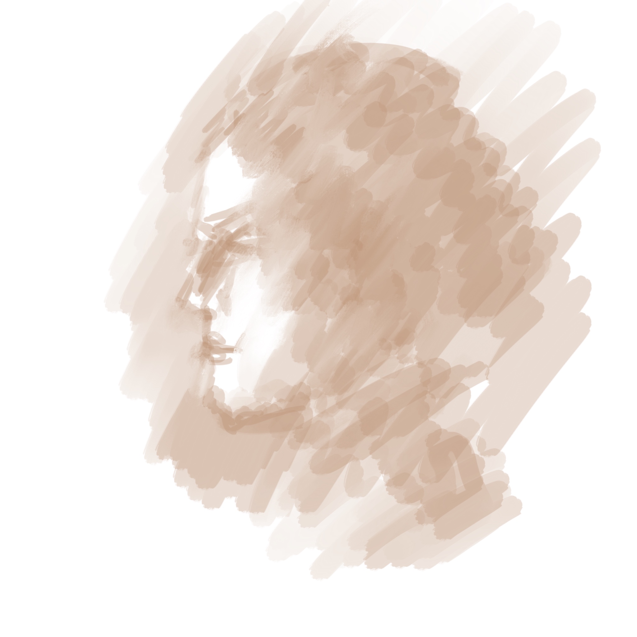
Geoff Watson, “Profile from imagination,” iPad sketch, 2018.
Geoff Watson, “iPad doodles,” iPad, 2018.
Not every painting is a success, but I try to learn from mistakes. In today’s life session, my back was hurting, but I tried to stand so I could view the model from the same vantage point I had last week. Not smart! I had trouble concentrating, and the figure did not improve. After a while I gave up, sat down, and just started messing around with the background instead. Not a huge success, but still interesting.

Geoff Watson, “Not my best,”oil study on panel, 12” x 16,” 2018.
Yesterday I had a different kind of failure. I drew a pretty good likeness of the model, and my first wash of watercolor enhanced it. I should have stopped there! Instead I overworked it. Then I compounded the error by adding eye detail after the model was gone, and of course I got them wrong, lol. You can get away with that in oil, as it’s easy to wipe out mistakes. Not so with watercolors! (A comedy of errors: my computer isn’t letting me upload it. Maybe for the best!)
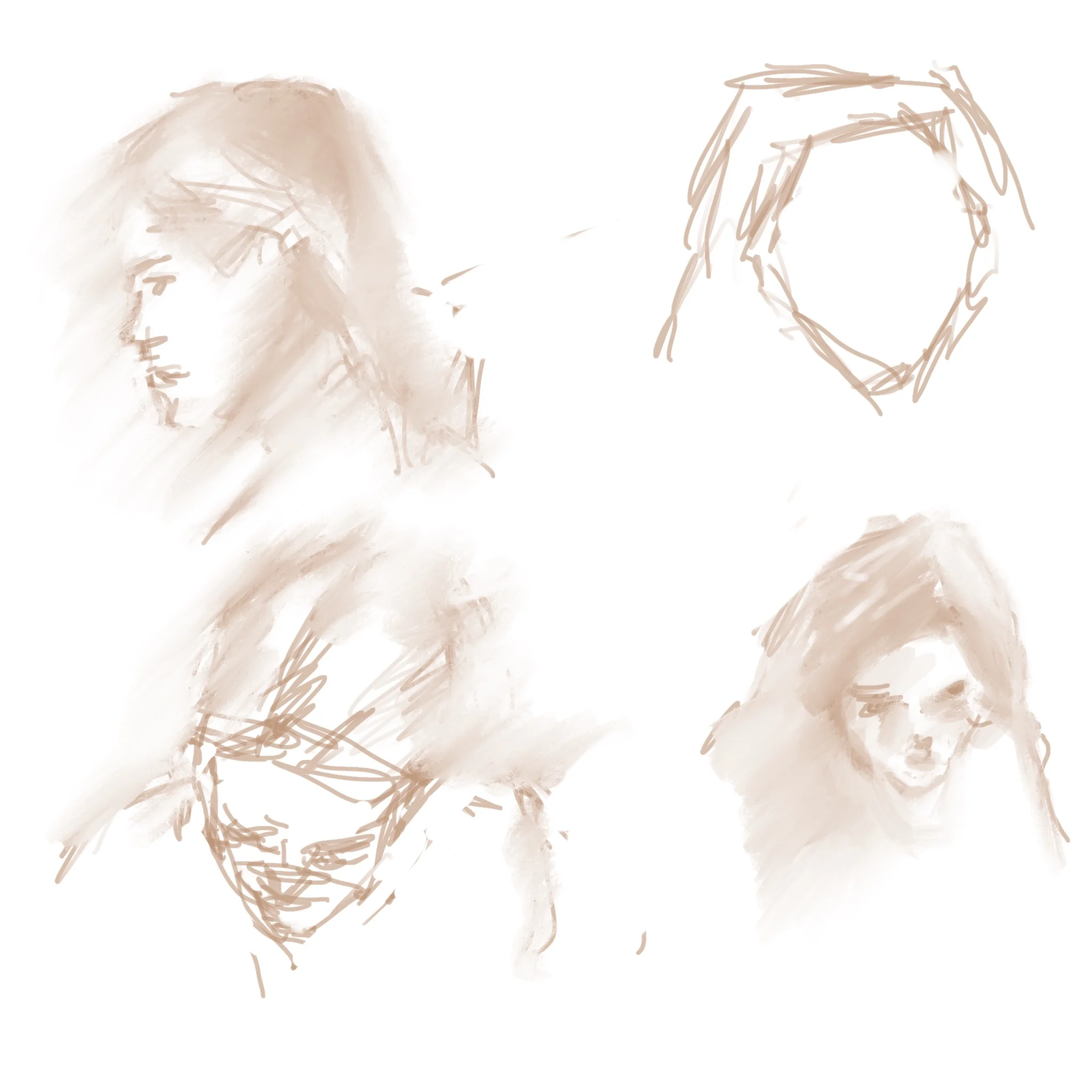
I’ve been experimenting with sketching on the iPad, using an Apple Pencil and Procreate. It’s fun, but it takes some getting used to. For now I’m working with just one color, as if using graphite. I still haven’t quite figured out how to smudge or soften edges, but I’m learning. Here’s one example.

Geoff Watson, “Anne’s chair,” iPad sketch, 2018.
At my life-painting session on Saturday, the room was crowded, and I found myself painting the model from this somewhat awkward angle. A bit racy! I considered just painting a portrait, but her face was pretty far away, so I thought about how to make a full-figure study that would be tasteful. I decided to use lots of soft edges, for a blurry look. Our instructor also suggested I emphasize the light on the figure against the very dark background.
At the very end of the session I started sketching in the pillows and drapery supporting her. I'm not sure I'll leave those in; we'll see next week.

Geoff Watson, "Reclining nude," work in progress, oil on panel, 12" x 16," 2018.
In today’s life class, our instructor asked us to mass in the form without drawing contour lines. She suggested amoeba-like soft edges, allowing us to push and pull things to refine the drawing. I like this approach. It took some of the pressure off the initial lay-in, and it promoted soft edges. We had only two hours, so it’s still rough, but I still feel I made a statement.
I only wish I’d painted this on a panel! All I had handy was a canvas pad. Maybe some future art historian will cut it out, put it on stretcher bars, frame it, and donate it to the Met. :-)
Geoff Watson, “Mallina,” oil on canvas pad, 12” x 16,” 2018.
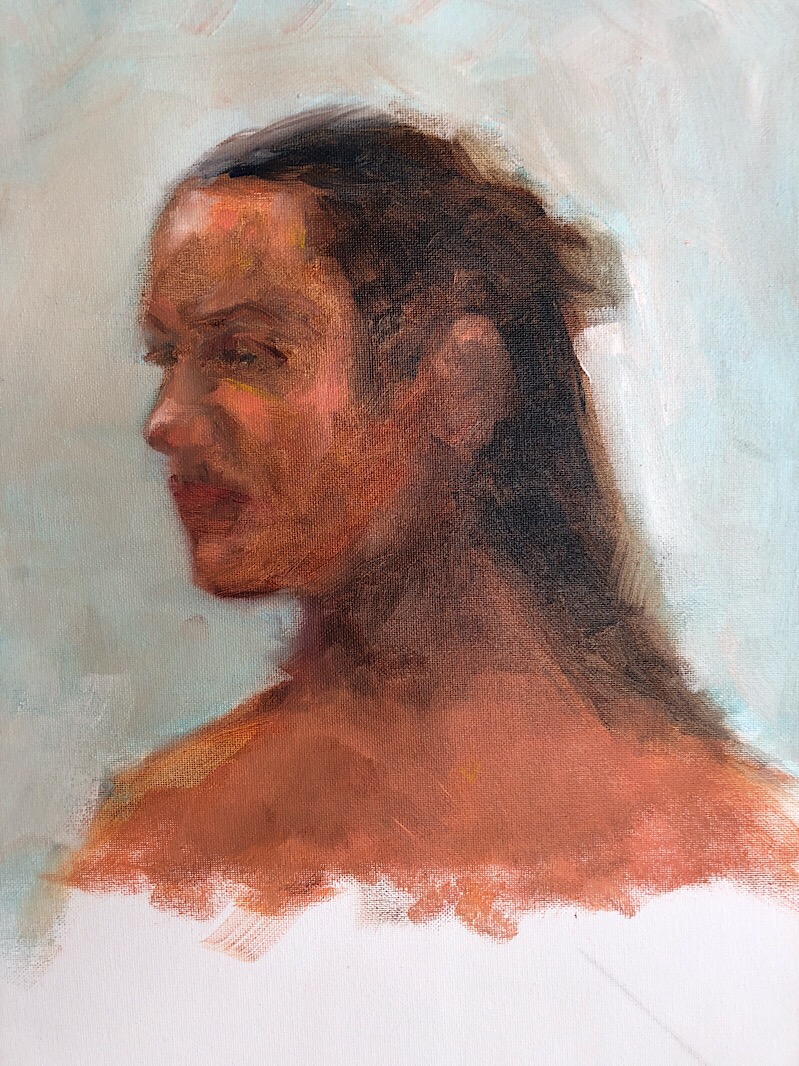
I had less than two hours to paint Wayne, but I was pleased with the results. I’ve given him a somewhat unhappy look, but it’s pretty faithful to how he appeared: he was holding a difficult pose involving ropes and cuffs!

Geoff Watson, “Wayne in profile,” oil on canvas panel, 9” x 12,” 2018.
What does math have to do with drawing? A lot, actually. In today's post, I thought I'd highlight two different approaches to drawing. These are time-honored methods that I've encountered in many books and art classes. They overlap, and I don't think one is necessarily superior to the other.
The first approach is taught by the instructor in my Saturday life session. He urges artists to start their drawing with straight lines, not curves. Part of his approach partakes of geometry. He emphasizes plumb lines to line things up, and he urges us to check angles and proportions constantly. And part of his approach reminds me of derivatives in calculus. To describe a curve, he suggests drawing the tangent to it in several spots, then gradually refining each tangent until the series of angled lines becomes a smooth curve. He discourages any shading until the basic contours are right. In this approach, you draw from the outside in.
Here's an example of one drawing I did with him on Saturday. You can still see some of the construction lines I used at the start. This was a short pose; I don't remember whether it was 5 or 10 minutes, but it was no more than that.

Geoff Watson, "Figure sketch using lines," charcoal on paper, 12" x 16," 2018.
The instructor at my Friday life session emphasizes a different approach. She urges us to mass shapes in without drawing contour lines at the outset. She wants light and shadow from the start. She encourages us to draw gesture lines with curves, not straight lines. She wants us to draw and paint from the inside out, not the outside in. Charles Sovek, in his fantastic book "Oil Painting - Develop Your Natural Ability," urges the same approach. This reminds me a bit of integration in calculus, in which you find the mass or volume under a curve. Or of the pretty curvy graphs you make in trig. OK, the connection to math may be more tenuous here, but I hope you get the picture (so to speak).
Here's an example of this more curvy, intuitive approach. This was a VERY quick gesture sketch -- 1 or 2 minutes, tops. So it's not really a fair comparison to the "linear" sketch above, which was a 5- or even 10-minute drawing. But I hope you get the idea.

Geoff Watson, "Figure sketch using mass," charcoal on paper, 12" x 16," 2018.
It was relatively warm today, so I paid another visit to Cabin John Park in Bethesda, Maryland. I painted a scene like this about seven weeks ago, in warm afternoon light. Today there was some sun, but it was not as intense, and the woods seemed more subdued. I painted this quickly; it took about two hours.

Geoff Watson, “Cabin John Woods in January,” oil on linen, 12” x 24,” 2018.
Here’s what I did in December. Not quite the same vantage point, and different light.

Geoff Watson, “Cabin John Woods in December,” oil on linen, 12” x 24,” 2017.
Today we did more quick figure studies in life class, and again I did several charcoal drawings that I may post later. For now, here’s a look at a 45-minute oil sketch. I was mostly interested in the backlighting around her head and upper body.
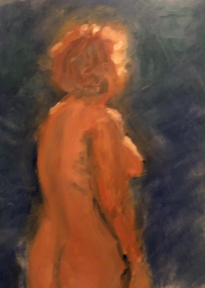
Geoff Watson, “Emily, backlit”, oil study on panel, 11” x 14,” 2018.
A couple weeks ago I posted some gesture studies in watercolor, which I did at the Art Students League in New York. Today I did some gesture studies in oil. The two I'm posting here both took 20 minutes from start to finish. Fun! I also a did a bunch of quick charcoal drawings. I may post some of those later.

Geoff Watson, Study, "Legs crossed," oil on panel, 11" x 14," 2018.

Geoff Watson, Study, "Standing," oil on panel, 11" x 14," 2018.
Today we visited the National Gallery's show on "Vermeer and the Masters of Genre Painting: Inspiration and Rivalry." It was a really rewarding exhibition! It featured 10 paintings by Vermeer, which was great in itself, but much of the point was to highlight contemporary Dutch Masters who inspired and competed with Vermeer.
These guys repeatedly explored much of the same everyday subjects and tropes: people (usually women) writing letters, primping in front of mirrors, making lace, pouring liquids, weighing or balancing things, receiving guests. The exhibit was arranged thematically, so there was a room on music, a trio of scientists, a pair of lace-makers, a room of letter-writers, and so on. The room on "men" was really fun. These Dutch artists generally preferred to paint women, and when they did include men, they were often ridiculous, clownish figures. We saw more than one "doctor" taking a woman's pulse while flirting with her or her maid. Oddly, though, I thought the men were better-looking than their women. Maybe this just reflects what models were available (or willing to model). Or maybe my 21st-century sensibilities are misleading me.
Gerrit Dou impressed with his naturalistic skin tones and marvelous drapery. Jan Steen made me laugh with his derogatory depictions of men -- quacks, flirty doctors, rakes, clowns. Frans van Mieris had some stupendous figure paintings, including one of my favorites, a tiny picture of a woman with a letter by candlelight. Metsu, ter Borch, and other Masters were featured too.
And of course it was a thrill to see a few Vermeers I'd never seen in person: the Geographer, the Astronomer, the Lace-Maker, a few others. And it's always nice to revisit old favorites. The "Girl with the Red Hat" is not part of the show, but I went to look at it anyway, as I always do when I visit the National Gallery. I'm working on a copy of it; someday I will post it here. It hangs next to another interesting painting by Dou, and next to that is a work attributed to Vermeer, a girl with a flute, that's less engaging than the gal with that crazy fuzzy crimson hat.
The show concludes this Thursday, the 18th, so if you happen to be in the DC area, now is the time to go. You can learn more here: https://www.nga.gov/exhibitions/2017/vermeer-and-the-masters-of-genre-painting.html

Johannes Vermeer, "Woman Holding a Balance," circa 1664.
I started this still life a few weeks ago but haven’t had much time to work on it until today. (I’m teaching this semester, so I’m busier.) This afternoon I sneaked in a couple hours on it, sketching in three new items. It may still need an object on the right, for balance. My original plan was to highlight the tall kettle/pitcher, but we’ll see.
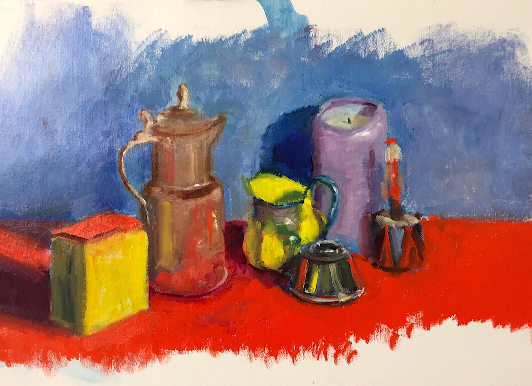
Geoff Watson, “Odds and Ends,” oil on linen, 14” x 18,” 2018.
I’ve had a miserable cold that’s bothering me a lot more than the cold weather. Today was the first day I’ve felt up to painting all week. I chose a subject close to my heart — or, more accurately, close to my throat.

Geoff Watson, “Cough drops,” oil on panel, 6” x 6,” 2018.
I spent two afternoons at the Met Museum in New York so that I could fully absorb the current exhibition of works by Michelangelo. What a spectacular show! My favorite bit was the room with studies for the paintings on the ceiling of the Cistine Chapel. There was a study of the Lord’s torso, and another of His fingers in a couple different poses. This may be heresy, but in some cases I preferred the study to the finished painting.
On my second visit I also took in the exhibit on David Hockney. I enjoyed it more than I expected I would. All the lush color was a welcome change from the earth tones of Michelangelo’s drawings.
If you’re in New York this month, don’t miss these shows!
https://www.metmuseum.org/exhibitions/listings/2017/michelangelo
Yesterday I did a few more quick watercolor sketches at the Art Students League. This timy portrait took 25 minutes. Not a bad likeness!
Geoff Watson, “Portrait sketch of Monica,” watercolor and graphite on paper, 3” x 5,” 2017.
These were 5-minute poses. Not a lot of time!

Geoff Watson, “Monica sitting,” watercolor and graphite sketch on paper, 3” x 5,” 2017.

Geoff Watson, “Monica extended,” watercolor and graphite sketch on paper, 3” x 5,” 2017.

Geoff Watson, “Sketch of Monica standing,“ watercolor and graphite on paper, 3” x 5,” 2017.
Today I brought a miniature watercolor set to the Art Students League in New York. Short poses are always a challenge, but especially in watercolor! Here is a 15-minute aketch.

Geoff Watson, “Monica,” watercolor sketch on paper, about 5” x 7,” 2017.
And here are a couple 5-minute poses.

Geoff Watson, “Monica reclining,” watercolor sketch on paper, 5” x 7,” 2017.

Geoff Watson, “Monica sketch,” watercolor on paper, about 4” x 6,” 2017.
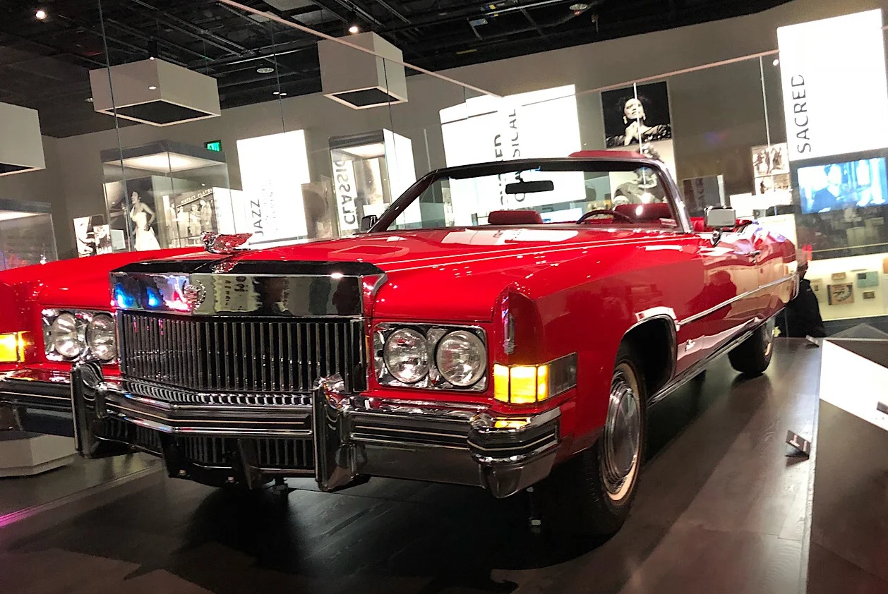
Today my family and I visited the Smithsonian National Museum of African-American History & Culture in Washington, DC. It was a great experience! I thought the historical portion of the museum was particularly well done. The highlight for me was the casket of Emmett Till, which people lined up to view, as if at a funeral service. It was extraordinary.
The museum also features a fascinating set of exhibits on African-American culture, including a wing devoted to fine art. I was especially impressed by two landscapes by Robert S. Duncanson (1821-72), an African-American painter influenced by the Hudson River School of grand, romantic vistas. One is "Robbing the Eagle's Nest," which you can see here: https://nmaahc.si.edu/object/nmaahc_2009.13ab . The other, "Garden of Eden," apparently reflects Duncanson's hope for a more just America. You can see it here: https://nmaahc.si.edu/object/nmaahc_2014.299?destination=explore/collection/search%3Fedan_q%3Deden%26edan_local%3D1%26op%3DSearch . (I'm not sure whether the images are in the public domain, and the museum didn't permit photography of the fine art, so I'm just providing links.)
There is a ton to see in this awesome museum! Here's one more example: Chuck Berry's Cadillac. How cool is that?
It’s been almost a week since I felt well enough to dig into my oil paints, but today I finally felt better. I added a pitcher and pot to my ongoing still life. Still lots to be done, but it sure feels great to be painting again.

Geoff Watson, “Pot and pitcher,” work in progress, oil on panel, 18” x 24,” 2017.
I’ve had a stomach flu for the past couple days. Today I felt well enough to sketch something and do a quick watercolor. I chose an object that has been getting a lot of my attention!

Geoff Watson, “Tylenol,” watercolor sketch on paper, 6” x 6,” 2017.